Showing posts with label Power BI. Show all posts

Monday, July 1, 2019

Renewed as MVP, 6th time in a row!


Honored to be renewed for the 6th time in a row as a Microsoft MVP in « Office Apps & Services » with a focus on Project and Portfolio Management (PPM).

Since 2014 it is always the same excitement to be part of such an amazing community.

Follow me on my blog to learn about Project Online/Server, PowerBI, Planner, Flow, SharePoint, etc…

Share this article :

Friday, October 12, 2018

Indented Schedule Tasks in Power BI #Tips

The other day, one of my US colleague asked our internal community for help in displaying project tasks in a table. The tricky part is that he wanted to display the task names indented as Microsoft Project would do. One of my fellow colleague (Jean Lieverman) working on Project Online and Power BI replied with the simplest yet super clever solution. 
I was so excited to see such a clever call that I wanted to share!

Here is the result
As you can see, we have here a nice table with indented tasks based on the outline level of the tasks.

The awesomeness is not necessarily in the visual result but in the way it has been built To get to that result, Jean created a new column (right click on the tasks table and add column) called "Task Padded" with the following formula:
Task Padded = REPT ( "     ", Tasks[TaskOutlineLevel] ) & Tasks[Task Name]

The formula will add as much tabulations as the outline number which references the level of indentation. Use that new column in your matrix or table and you are all set!

I hope that will help some people who might want to achieve the same.
Special Credit to Jean 👍
Take care.
Share this article :

Tuesday, October 10, 2017

Power BI: Chiclet slicer with image

Hi, 
I haven't been playing and blogging with PowerBI since a while. Recently for a new customer, I had to display a filter on a PowerBI report to include/exclude important projects which need to be reviewed at board level. Since my tenant was in French but the report was in English, I had something really not satisfying, displaying TRUE or FALSE in a slicer, not really meaningful. The board wanted to have something more graphical. You would just click on the green check mark to select flagged projects. 

Nice isn't it?

Basically, in MS Project it is not more than having a flag enterprise custom field in a PDP to flag in or out projects, associated with a graphical indicator. In the project center, flagged projects are displayed with check marks.

First, find on Internet (free of rights) icons corresponding to your need. Prefer PNG format so the icon's background will be highlighted when selected. You can store the icons on a shared library on your PWA instance, accessible at least in read-only by all Power BI users.

Then in Power BI Desktop, you have to import a custom visual named Chiclet slicer. I won't go in details on how to do this, it has been blogged many times already: here is the support article you can refer to. Once done, open the query editor, select the data source containing your flag (ProjectData in my case) and create a new conditional column.

You'll be able to enter a name and generate outputs based on condition. In our case, the output will be the image URL for each value of the custom field (TRUE or FALSE), with a "else if" condition.

Once validated without error and back to Power BI desktop, you can select your dataset then your new conditional column. In the "Modeling" tab, under "Data category", select "Image URL".

In your report, add the new chiclet slicer visual and drag:
  • the flag enterprise custom field in the category and values zones,
  • the new URL conditional column in the Image zone.


In the widget format settings, you can specifiy the size or the chiclet and the split of the image (100% in my case so only the image is displayed, not the label).

Et voilà!! Note that you can even do that with the Enterprise Project Type which is a pretty common filter. The challenge is more to find meaningful icons. 

You'll also note the nice graphical rendering using conditional formatting in table and the Gantt custom visual which particularly applies to Project Online context. 


Share this article :

Friday, November 11, 2016

Playing around with the PowerBI mobile app

I've been working with PowerBI since the first weeks it was available and I could follow the ramp-up of the capabilities. You know if you're following me that I love blogging about PowerBI.
Working since a couple of month with a new customer who is deeply involved in the digital transformation, I are willing to give access to the top management to a set of dashboards. I wanted to anticipate their requirements so I downloaded (why didn't I do it before??) the PowerBI app


I created 2 simples dashboards in 1 hour just to test the app. Note that they are draft and still require to be improved. After getting authenticated, you land on a home page where you can navigate in your various workspaces. Like in PowerBI app, you'll see reports and dashboards which you can add a favorites.


Then you can access your dashboard, playing around with the data. You can also share dashboards with people in your organization.


Note that in my example, I have a lot of information on the dashboard. On a WP10, it is quite tedious to use the segments. It should be easier on a tablet, but I do advice to create lighter dashboards with less information to make easier the manipulation. I think it is better to have many light dashboards (since it is easy to navigate between dashboards using the favorites) than having a few complex dashboards.

Notice how easy and fast it is to create a WOOW with your customer, simple tool, complete dashboard, user-friendly app, in just 1hr!


Share this article :

Monday, March 7, 2016

Embed your Power BI dashboard in Project Online

A while ago, I've been asking to our french Microsoft BI guru Frank Mercier if it was possible to integrate a PowerBI report into a Project Online page. The answer was "unfortunately, no (t yet)..". I was quite frustrated because we all know that our customers do love the "all in one place" principle. Saying them that they must navigate to another ecosystem in order to view their favorite reports was not a good promotion for our PPM solution.

If you are a regular reader of my post, you know that I do love PowerBI, have often blogged about it due to the regular updates the product team brings to the solution. So you might guess what is coming below, don't you..?

You can now integrate your PowerBI dashboards in Project Online. And guess what, it take 2 steps!

Go to the file menu:


Retrieve the embeded code choosing the frame size:

Then go to your Project Online home page, insert a new content editor webpart:

Paste the embeded code in the HTML source code dialog box:

That's it!!
The dashboard contains all the tabs and is dynamic.

After a few layout improvments on your homepage, it could looks like the following capture. You could integrate your PowerBI dashboard in a new PDP following the procedure above (I suggest to follow Jerome's advice and use a script editor webpart) and create a carousel on the homepage with a promoted link app, and also add the PDP in the quick launch menu.

Warning: When you use Publish to web, the report or visual you publish can be viewed by anyone on the Internet. There is no authentication used when viewing these reports. Only use Publish to web with reports and data that the anyone on the Internet (unauthenticated members of the public) should be able to see. Do not use Publish to web with sensitive data, data that has financial implications, data that must remain confidential, or data that you do not have the license rights to publish.

Share this article :

My updates on the Power BI March release

Hello everyone

Please see below a big list of things which happened on Power BI this month! My highlights are:

Power BI

-          Preview of the external dashboard sharing. This has been a top voted feature in the PowerBI user voice. If Project team is using it well, we may have great
outcome of the Project uservoice. The access can then be managed on a person bases and the overall functionality can be disabled in the O365 admin
centre
-          You can now add widget in any dashboard, this will allow to embed any code in your dashboard like a YouTube video (why not)
-          Allowing touch zoom for touch screens on dashboards

Power BI Desktop

Again, a new version of PowerBI Desktop has been released including;
-          Ability to see data behind a visual and export it to CSV
-          Support navigation hierarchy, KPI and display folder from SSAS
-          New exciting visual allowing to see a KPI with its trend, I see a great value!


-          Ability to define your own hierarchies to allow drill-down in the reports like (Portfolio, Project, Program or Year, Quarter, Month)
-          DirectQuery Mode – Support for creating Calculated Columns

Power BI Mobile

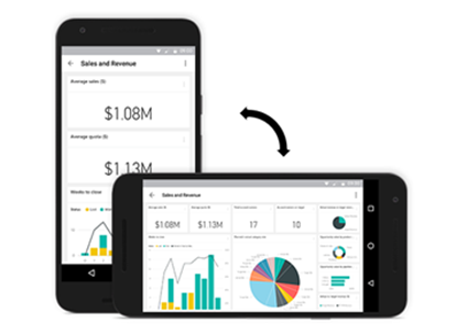
-          New Landscape mode for android
  
-          Ability to interact with reports directly from the phone
-          Ability now to consume reports on phones starting with IPhone and Android!

Power BI Gateway

Power BI gateways are here to help connect on-prem data to the online world the enterprise gateway has been updated this month with:
-          live connection to Oracle ad Teradata
-          scheduled refresh for most of data sources (SQL Server, Teradata, Oracle, DB2, MySQL, Sybase, SAP HANA, OData, Web, Files and Folders on-premises, and
SharePoint list on-premises)

My 2 cents

I have made some tests of some cool visuals this month including Waffle chart and Sankey report. Here is the result on resource assignments
Share this article :

Monday, January 4, 2016

PowerBI Now Available on Windows Phones 10

It is my turn to wish all a joyful 2016.
I've been quite quiet for the past year but one of my 2016 wish is to share my knowledge with you all.
One of my point of interest since I moved from Canada to Australia is the great revolution is pushing in data analytics and more especially Power BI

So let's start now!

Just before NYE, The Power BI team announced Power BI for Windows 10 Mobile devices. I was waiting for a while as I have a Windows phone myself. Unfortunately, it is not working on my Nokia Windows 8 phone :(.

You can find the article here from where I extracted some screenshots
http://blogs.msdn.com/b/powerbi/archive/2015/12/30/announcing-the-power-bi-app-for-windows-10-mobile.aspx


As of now, Power BI Application is available for 
  • Windows 10 PC, Tablet and Phone
  • Apple iPhone and iPad
  • Android Phone (4.4+) 
  

Enjoy
Share this article :

Wednesday, November 18, 2015

Power BI content pack for Project Online available!

Hi Power BI fans!

Didn't I tell you that Microsoft was putting a lot of efforts on Power BI and Project Online? Here is the lastest evidence: a Power BI content pack for Project Online was released this morning. So what are we talking about? Let me test it for you.

First of all, connect to Power BI and navigate to the "get services" menu. Now you'll see that you can select a Project Online service.


Once done, enter your Project Online tenant URL and logged with your admin account. The content pack will be imported and you should get this message which tells you more or less "operation successfull, your Project Online dashboard is ready!".


You'll see that in the left menu your Microsoft Project dataset, report and dashboard.


Done! Note the different tabs allowing you navigating through the dashboard. You can know navigate in the various precreated reports, and of course customize them adding filters and so on.


Finally, don't hesitate to play around with the Q&A:

Hope you'll like it!

Share this article :

Friday, October 30, 2015

Power BI new visuals

Hi,

To continue on the PowerBI serie which is so far a great success, here is a quick post about the Power BI Desktop new visuals. A couple of weeks ago was announced the availability of a new visuals gallery. See here: https://app.powerbi.com/visuals


It allows you, assuming you have an up to date version of Power BI Desktop, it is as simpler as downloading the visuals and upload it to Power BI. Then just us it!!

Here is how to proceed: 

1 - Download the visuals 


2 - Import the visuals
Once you download the visuals, you can open in Power BI desktop application a new or existing file. You'll see the 3 little dots (I heard it is called an ellipsis, better than "3 little dots"...). From there, just pick-up your new visuals one by one.


3 - Use the visuals
Finally just select a visual and add data, dimensions, measures to have a nice and unseen graph!


Hope you'll enjoy all the effort Microsoft is putting on the PowerBI solutions and you'll take some time to play with it!

Share this article :

Thursday, August 27, 2015

My first Power Map tour!!

A while ago I wrote a blog post about Power BI tools. At this time I had no Excel 2013 available so I played only with Power BI desktop and Power BI App which don't require Excel 2013. But to give a first overview of the Power BI tool, I share with you this simple but clear picture from Devin Knight's website, a fellow SharePoint MVP.


I was able to build really nice reports without Excel 2013 and my post has been read by many folks, one of the most successful post I wrote! But unfortunately I was not able to play around with Power Map: indeed it is not available with Power BI App, even though you can create a map report but without all the nice features provided by Power Map. 

But you know what? I finally managed to get Excel 2013! The first thing I did was to install all the Power BI addons and start playing with Power Map. So let me share with you my first little Power Map tour. Please be indulgent with me, that's a first shot! But to give you the envy to go through this post, here is what you'll be able to achieve:

Set up Excel 2013
First step is to download the addons and activate them in Excel. Once downloaded, you can go to the COM Add-ins dialog box and check all required items.
Figure 1: add the Power BI tools to Excel 2013
You can see that you have now extra tabs in the ribbon. Moreover if you navigate to the "Insert" tab, you'll see the Power View and Power Map groups.

Connect to the data source
I won't go in details on how to retrieve the data from Project Server / Online. It has been documented in many blogs particularly using oData feeds, which is pretty straight forward. Once done, you'll get for example your Project oData feed data in your Excel sheet.
Figure 2: oData feed in the Excel sheet

Add the data to Power Map
Once you open Power Map, you'll get it open as a new application but strangely, no data inside. It doesn't include automatically the data from the current datasheet.
Figure 3: Power Map first opening with no data
Then go back to Excel, select your table and add it to Power Map.
Figure 4: add your data to Power Map
Here is what you get.
Figure 5: oData feed added to Power Map
Start with Power Map
Basically here is how Power Map works:
  • The highest entity is a tour which you can export only as a video when you have finished
  • In a tour, you have different scenes which can be seen as a slide in a PowerPoint document
  • In a scene, you can defined layers, which correspond to dataset you'll display on the map
  • Each layer has some properties such as location, data, category, chart type, scene settings etc...
Note that obviously you must have a custom field related to the location in order to have relevant layers, such as a location project enterprise custom field. In my case, you can see below in PWA/Project Center that I have a "location" project level ECF associated with a lookup table.
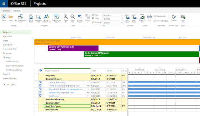
Figure 6: location project enterprise custom fields in PWA
Add the data
First thing, I rename the default tour name and default layer name.
Figure 7: layer renamed
Then pick up your location custom field. If the location values are automatically recognized, you'll see the corresponding pointers on the map.
Figure 8: location added to the layer
Then it is time to add the data in order to create your scene. In my example, I choose the project duration and actual duration. You can see that I can choose between 5 chart types.
Figure 9: data added to the layer
Format the scene
Ok, start to look good, isn't it?? If you move your mouse cursor over the bar, you'll see the selected data like you can do with Power View. Now it is time to do some formatting choosing a theme and showing labels.
Figure 10: formatting the scene
Format the layer
As said before, you can now configure the layer. For example you can change the shape of the bars, the opacity, the height or thickness and the color.
Figure 11: formatting the layer
It might look like this (note the buttons in the map group of the ribbon).
Figure 12: layer formatted
Configure the scene
The scene can be configured in order to record the final video. You'll be able to set the effect, effect time and speed.
Figure 13: configure the scene
Improve your tour
Once you have understood those principles, you can easily create more complex tours, adding more scenes. In this second scene, I added pie charts with the project duration per enterprise project types.
Figure 14: second pie chart scene
I can also add a text box to give a description or any meaningful comments.
Figure 15: text box added
Finally you can add 2D chart. It will add a chart with the data of the active map.
Figure 16: 2D chart added
Export your tour
Here is in my own point of view one of the limitations. I found no other way for exporting my map than exporting a picture or creating a video. Meaning that I can't just have my map as a report embedded in an Excel sheet and which I could expose in a SharePoint context such as a PWA PDP. I do hope that since I'm still learning the Power BI tools, there is something that I missed about the Power Map export... As far as I understood, the closest thing available to Power Map would be PowerView's Bing maps integration, which is part of SSRS and also requires PowerPivot. 
If someone can bring some light on this particular topic, I'd be glad to here!

Here is my scene exported as a picture:
Figure 17: scene exported as a picture
Just to be sure that I'm correctly linked to my PWA tenant data, I take 2 UK projects and mark all activities as completed to see if I can see immediatly the impacts on my Power Map tour.
Figure 18: refresh oData feed from Power Map
I can see that the UK data are correctly updated.
Figure 19: UK data updated
If I select the UK projects' actual duration (blue stack), the same data is highlighted on the map.
Figure 20: data highlighted

You can also export your entire tour as a video, even with a soundtrack:
Figure 21: exporting the entire tour as a video
Unfortunately, here is where my laptop crashes time after time. Encoding the tour as a video is quite resource consuming and apparently too much for my computer. I'll make some more tries and hopefully I'll post the video soon.

Looking ahead, a final comment would be that with Excel 2016, all Power BI addons (Power View, Pwoer Query, Power Pivot, Power Map) will be natively shipped with Excel and no more accessible as addons. It will make the usage of those addons more intuitive.

Share this article :