For once, I won't write about Project Server but about a related topic: Excel! Actually both applications are closely interrelated since Excel through Excel Services allows creating tremendous reports using Office Data Connection (ODC) files on OLAP database or reporting table (it took me a while to get used saying "table" instead of "database" for PS2013!).
Excel 2010 brought a nice feature as the slicer for filtering data in pivot tables. This gave a nice graphical and mobile-adapted (smart phones, tablets) way to filter information. You could deploy thanks to this feature more user-friendly dashboards.
Excel 2013 goes on furhter this way introducing the timeline filtering feature that works similarly to the slicers. You can insert a timeline based on the time dimension (year, month,...) and link it to one or more pivot tables. Here is an example on the Excel Services sample dashboard that comes out-of-the-box in Project Server 2013 BI Center.
 |
| Figure 1: timeline filtering feature in a Excel Services dashboard |
Then after filtering with the timeline:
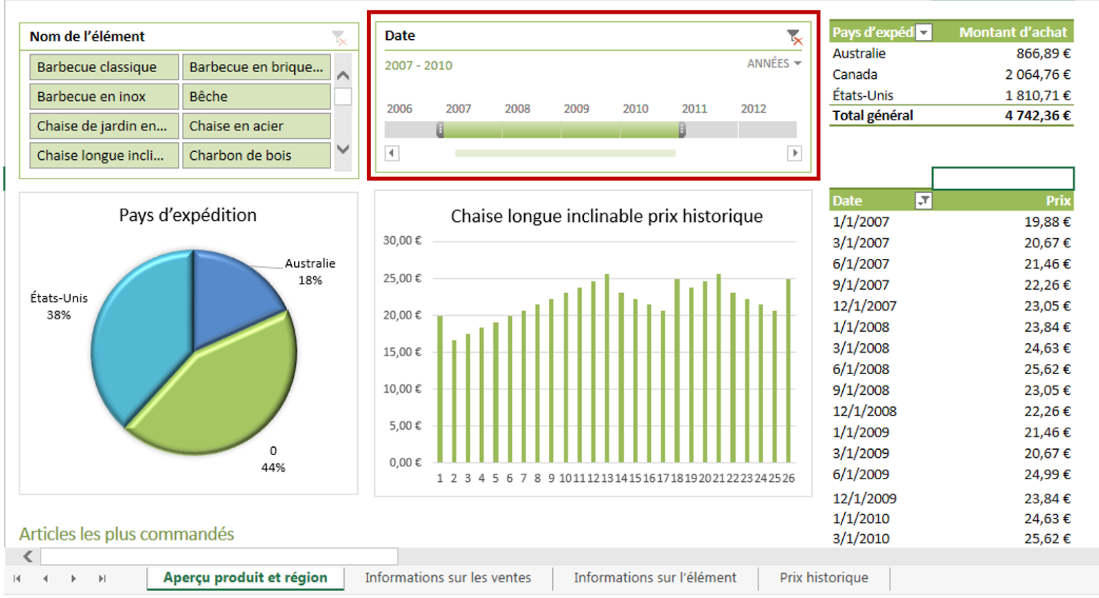 |
| Figure 2: dashboard filtered with the timeline |
Now how to do it? You first need to start with an Excel file embedding data. It could be with an ODC (reporting table or OLAP data) as per my example below. Note that it won't work for MS Project visual reports, since timeline cannot use offline OLAP connections.
From the "insert" tab in the ribbon, "filter" section, select "timeline" option:
From the "insert" tab in the ribbon, "filter" section, select "timeline" option:
 |
| Figure 3: insert a timeline on a pivote table |
 |
| Figure 4: timeline connection and formatting options |
Et voilà!! If you had fun using the slicers, you'll love creating and using dashboards with the timeline!
No comments :
Post a Comment